

TL;DR:
- Arizona’s landscape features a rich, layered color palette that combines earth tones, desert greens, and sky blues, reflecting its diverse environments. Dressing with authentic Arizona style involves tonal earthy hues, contrasting whites, and subtle layers that honor the region’s natural beauty, while avoiding neon and black for comfort and harmony. Building an outfit around a core palette with balanced contrast creates a genuine, grounded Arizona-inspired wardrobe suitable for any season or occasion.
Most people picture Arizona and immediately think of dusty brown dirt and bleached-out sand. That assumption stops a lot of travelers and locals from building truly striking, memorable wardrobes rooted in the Southwest. The truth is, Arizona’s landscapes carry one of the most rich and layered color stories in North America, from the deep rust and terracotta of Sedona’s rock formations to the silvery sage of the high desert and the intense cobalt of the open sky. Once you understand how those colors work together, dressing with authentic Arizona style becomes effortless, flattering, and genuinely fun.
Table of Contents
- Why Arizona’s color palette stands out
- Core elements of Arizona color palettes
- Making your wardrobe ‘feel’ Arizona
- Adapting color palettes by season and occasion
- One thing most stylists miss about Arizona color palettes
- Show off your Arizona-inspired style
- Frequently asked questions
Key Takeaways
| Point | Details |
|---|---|
| Palette highlights | Arizona colors include rich earth tones, sage greens, dusty blues, and cream for impactful, easy-to-wear combos. |
| Contrast matters | White and cream bring outfits to life and work well for photos among red rocks. |
| Avoid harsh shades | Steer clear of neon, hot pink, and true black to stay comfortable and harmonious with the scenery. |
| Seasonal flexibility | Arizona palettes adapt seamlessly for any climate or activity, keeping your look fresh year-round. |
Why Arizona’s color palette stands out
Now that you see Arizona color isn’t just brown on brown, let’s explore what makes these shades so distinctive.
Arizona’s visual identity is shaped by an extraordinary variety of landscapes packed into a single state. You have towering red rock formations in Sedona, saguaro-studded Sonoran Desert stretching south toward Tucson, cool ponderosa pine forests near Flagstaff, and vast stretches of open sky that shift from electric blue during the day to amber and violet at dusk. Each of these environments contributes a specific set of colors that together form one of the most cohesive and recognizable regional palettes anywhere.
What makes this palette truly special is that it isn’t just visually beautiful. It resonates emotionally. Earth tones like rust, camel, and tan communicate groundedness and warmth. Sage and olive greens evoke calm and a quiet kind of resilience. Dusty blue, whether borrowed from the sky or from the shadow side of canyon walls, adds a subtle lift that prevents an outfit from feeling too heavy. These are colors that make you feel relaxed and rooted at the same time. That’s a rare combination, and it’s exactly why Arizona-inspired apparel has such lasting appeal beyond the state’s borders.
The way landscape shapes regional apparel is well documented in fashion circles. When a color palette mirrors its environment that closely, wearing it feels authentic rather than trendy. It reads as a genuine expression of place rather than a fashion statement borrowed from somewhere else.
Here are the key landscape sources that feed the Arizona palette:
- Red rock country (Sedona, Moab corridor): Deep rust, burnt sienna, terracotta, and brick red
- Sonoran Desert floor: Tan, warm sand, dusty camel, and pale ivory
- Desert vegetation (cacti, palo verde, creosote): Sage, muted olive, and dusty yellow-green
- Arizona sky and shadows: Cobalt blue, dusty slate, lavender dusk tones
- Sunset sky: Tangerine, golden yellow, peach, and fading coral
One of the most practical insights for styling Arizona-inspired outfits comes directly from travel photography. Arizona travel fashion guidance consistently highlights that tonal earth colors like tan, camel, rust, sage, olive, and dusty blue create the most harmonious looks against the red rock backdrop, while white and cream add high-contrast clarity that photographs beautifully. On the other hand, bright neon and hot pink can clash aggressively with the landscape, and true black absorbs heat so effectively that it becomes genuinely uncomfortable on a warm Arizona day.
“The most flattering outfits in Arizona are the ones that feel like they grew out of the desert itself. Tonal earth tones, a touch of dusty blue or sage, and the clean lift of white or cream. That combination works in almost any setting, from a canyon hike to a rooftop dinner.”
The emotional and practical dimensions of this palette are inseparable. Understanding both is what separates someone who wears Arizona colors from someone who truly gets Arizona style.
Core elements of Arizona color palettes
With a sense of Arizona’s visual language, let’s zoom into the most popular palette themes and their component colors.
Arizona color palettes are organized around a few central themes, each pulling from a slightly different slice of the desert experience. If you’ve ever searched for inspiration online, you may have come across hex-based palette collections. One well-known set features themes like “Desert Sunset,” “Desert Nights,” and “Sunset and Desert” with warm earth tones, rich reds, and sunny yellows as their backbone. These ready-made palettes are genuinely useful as a starting reference, but understanding the underlying color families matters even more.
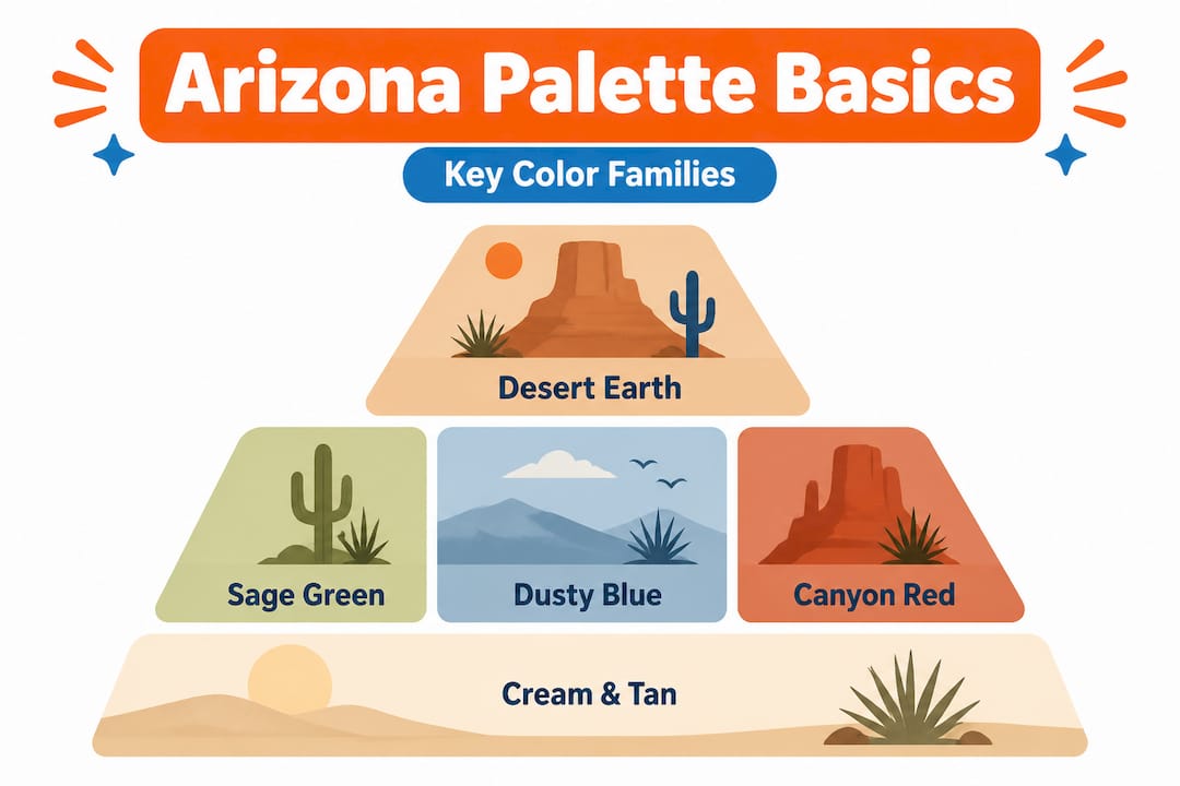
Here’s a breakdown of the core color families and where each fits in a well-rounded Arizona-inspired wardrobe:
| Color family | Key shades | Best use in apparel |
|---|---|---|
| Warm earth tones | Rust, terracotta, camel, brick | Tops, hoodies, statement pieces |
| Neutral base tones | Tan, ivory, warm sand, cream | Bottoms, layering pieces, totes |
| Desert greens | Sage, muted olive, dusty green | Accents, hats, secondary pieces |
| Sky and shadow blues | Dusty blue, slate, cobalt | Graphic elements, prints, accessories |
| Sunset and golden tones | Amber, golden yellow, peach | Seasonal accents, graphic overlays |
| Contrast neutrals | White, off-white, cream | Layering, clean contrast, photography |
Each of these families works as a standalone foundation, but the real magic happens in combination. A tan base paired with a rust accent and a dusty blue detail is a classic Arizona three-tone formula. It’s balanced, interesting, and immediately reads as Southwest-inspired without being costumey or overdone.
The contrast principle is worth spending extra time on. White and cream are not neutral afterthoughts in this palette. They carry a lot of visual weight. Against the red and orange tones of the desert landscape, a crisp white or warm cream creates a striking contrast that photographs beautifully and keeps your overall look from blending entirely into the background. When you’re standing in front of a red rock formation, a cream top makes the scene pop around you in a way that a tan top simply won’t.
At the same time, the guidance around black and neon is not just aesthetic. True black absorbs significantly more solar radiation than lighter desert tones, making it a genuinely poor choice on a hot Arizona day. Neon colors don’t just clash visually with the muted, organic landscape. They compete with it in a way that feels jarring in person and looks even worse in photographs.
Learning the basics of desert fashion helps you see these color choices in the context of fabric, cut, and layering as well. Color and fabric work together. A rust-colored linen tee reads very differently than a rust-colored polyester blend, even if the hue is technically identical.
Here’s a quick list of the most versatile individual colors to anchor your Arizona-inspired wardrobe:
- Camel and warm tan (the great unifiers, they pair with everything)
- Terracotta and rust (the statement workhorses of the palette)
- Sage green (the calming accent that adds depth without noise)
- Dusty blue (the subtle pop that keeps things visually interesting)
- Ivory and off-white (your high-contrast tools for photos and layering)
Pro Tip: When building a new outfit or buying a new piece, pick one palette theme and pull two to three colors from within it. Keeping your choices within a single palette theme removes almost all the guesswork from coordinating.
Making your wardrobe ‘feel’ Arizona
Understanding the elements is powerful. But let’s make it actionable with clear outfit-building steps and common styling mistakes to avoid.
The goal isn’t to dress like the desert is your costume. It’s to build outfits that feel grounded, effortless, and connected to the place you’re in or the place you love. Here’s a practical step-by-step approach to doing exactly that.
-
Choose your anchor color. Start with one warm earth tone as your dominant piece. Camel pants, a rust hoodie, or a terracotta t-shirt all work well. This is your visual foundation.
-
Add a secondary tone from the same palette. If your anchor is rust, reach for sage or dusty blue as your second color. If your anchor is tan, consider a muted olive or ivory. The secondary color should be softer or cooler to create natural visual balance.
-
Decide whether you need contrast. If your outfit is very tonal (all warm earth shades close in value), add a cream or white piece to lift the look. A white tote, cream sneakers, or an off-white layer does this effortlessly. If your palette already has good contrast built in, you may not need it.
-
Accessorize with texture and restraint. Arizona style is not maximalist. Leather sandals, a woven hat, a simple silver detail, or a canvas tote are enough. Accessories should support the palette, not fight it.
-
Audit for busy prints. As Arizona travel fashion guidance confirms, busy prints are consistently discouraged for photogenic, flattering results in desert settings. Tonal palettes, with earth colors and white or cream overlays, are simply more versatile and more flattering in that environment. If you love prints, choose ones with a limited color count that stays within the palette.
-
Check your footwear. Dusty tan leather, light-washed denim details, or warm brown tones ground an Arizona outfit. Bright white athletic shoes can work but may feel slightly at odds with a more tonal, earthy outfit. Trust your eye.
For vacation outfit ideas that go beyond basics, layering becomes particularly important. Arizona mornings and evenings can be surprisingly cool even in warm months, so having a sage-colored layer or a camel-toned hoodie ready extends both your comfort and your style options throughout the day.
Common styling mistakes to avoid:
- Wearing all the same value (all dark or all light) without any contrast
- Mixing warm and cool tones without a bridging neutral
- Over-accessorizing with colors from outside the palette
- Choosing dark colors for midday desert heat for purely aesthetic reasons
Pro Tip: Anchor your look with one main earth tone, then decide between a subtle pop (sage or dusty blue) and a clean contrast (cream or white). You rarely need both in the same outfit. Pick one approach and commit to it for a cleaner, more confident result.

Adapting color palettes by season and occasion
With the basics of outfit building covered, it’s smart to tailor those choices further by both season and occasion, for a truly dynamic wardrobe.
Arizona is not a monoclimate state, and that matters a great deal for apparel choices. Phoenix summers regularly exceed 110°F, while Flagstaff winters bring snow and freezing temperatures. Sedona is gloriously mild in spring and fall but can surprise visitors in both summer and winter. Your palette stays mostly consistent across seasons, but the weight, coverage, and contrast level of your choices should shift.
Arizona weather and fashion guidance reinforces a principle that experienced desert dwellers know well: color and fabric work together for both visual harmony and physical comfort. Light-colored, loose-woven fabrics in warm earth tones or ivory are not just aesthetically appropriate for summer. They reflect heat and protect skin in a genuinely practical way.
Here’s how the palette adapts by season and occasion:
| Season/Occasion | Recommended colors | Notes |
|---|---|---|
| Spring | Sage, dusty blue, ivory, warm tan | Transitional tones, light layers welcome |
| Summer | Ivory, cream, pale tan, light sage | Prioritize lighter values for heat reflection |
| Fall | Rust, terracotta, deep camel, amber | Richer tones feel seasonally right, add warmth |
| Winter | Deep rust, warm brown, ivory, slate blue | Layering in tonal earth tones, heavier fabrics |
| Hiking/Outdoors | Tan, olive, dusty blue, cream | Sun protection and natural camouflage blend |
| Social events | Terracotta, rich rust, dusty blue, sage | Bolder tones work well in social settings |
| Daily wear | Any core earth tone with cream or ivory | Simple, consistent, always appropriate |
A few easy adaptation tips whether you’re a local or a first-time visitor:
- In summer, shift toward lighter values of your favorite hues rather than swapping palettes entirely
- In fall and winter, reach for your richer, deeper earth tones like rust and amber to stay within the palette while adding visual warmth
- For outdoor activities, sage and olive green blend naturally with desert vegetation while still looking intentional
- For evening events, dusty blue or deep terracotta elevate the palette into something that reads as genuinely polished
- Visitors often benefit from packing one cream or ivory piece and one rust or terracotta piece. Those two alone cover most occasions and photograph beautifully in almost every Arizona setting
Exploring desert print styles can help you see how pattern interacts with these seasonal shifts. A minimal geometric print in sage and tan reads completely differently in summer linen versus a winter fleece, even though the colors are the same.
The core principle for seasonal adaptation is simple. Keep your palette consistent, but adjust the value and weight of your choices based on temperature and occasion. The Arizona palette is remarkably flexible when you approach it this way.
One thing most stylists miss about Arizona color palettes
We’ve covered the technical aspects, but here’s where most style guides fall short.
Most articles about Arizona fashion stop at “wear earth tones and avoid neon.” That advice is correct, but it’s incomplete in a way that leaves people dressing in safe, forgettable outfits rather than genuinely striking ones. The conventional wisdom treats the palette as a set of restrictions. We think it’s better understood as a framework for creative expression.
Here’s the truth we’ve seen play out again and again, both in the apparel we design and in the outfits that actually catch people’s attention in desert settings. The best desert-inspired clothing doesn’t just follow palette rules. It uses subtle contrast and layered tone to create visual tension that keeps the eye engaged.
A completely tonal, low-contrast outfit in camel and tan looks appropriate, but it rarely looks interesting. The photographs feel flat. The person wearing it blends into the background rather than standing out against it. That’s the failure mode that safe, rules-only styling produces.
What actually works is a slight push against the tonal harmony. A terracotta t-shirt paired with dusty blue and finished with a cream outer layer creates three distinct stops for the eye while staying fully within the palette. The contrast is present but not jarring. It feels earned rather than accidental.
We’d also push back on the idea that “creative” means “colorful” in the traditional sense. Arizona creativity in fashion is actually about subtlety and specificity. Choosing the right value of dusty blue matters more than choosing between blue and green. Getting the warmth level of your tan correct (warm sand versus cool gray-tan) determines whether your whole outfit reads as cohesive or slightly off.
The most common mistake we see is someone buying all the right colors and still ending up with an outfit that doesn’t quite work because the warmth levels are mismatched. Warm rust and cool gray-blue sitting next to each other without a bridging neutral creates a low-grade visual tension that people can feel even if they can’t identify it.
The solution is to develop your eye gradually. Start with one Arizona-inspired piece you love, then build around it. Let the piece tell you what it needs. Over time, you’ll develop an instinct for the palette that goes beyond rules and becomes genuinely personal.
Show off your Arizona-inspired style
Inspired to make your wardrobe reflect the spirit of the Southwest?
Now that you understand how Arizona’s color palette works from the ground up, from the rust of the canyon walls to the dusty blue of the open sky, you’re ready to start building a wardrobe that feels genuinely rooted in this place. Whether you’re a longtime resident wanting to wear your regional pride more intentionally, or a visitor who wants to take a piece of Arizona home with you, the right colors and designs make all the difference.
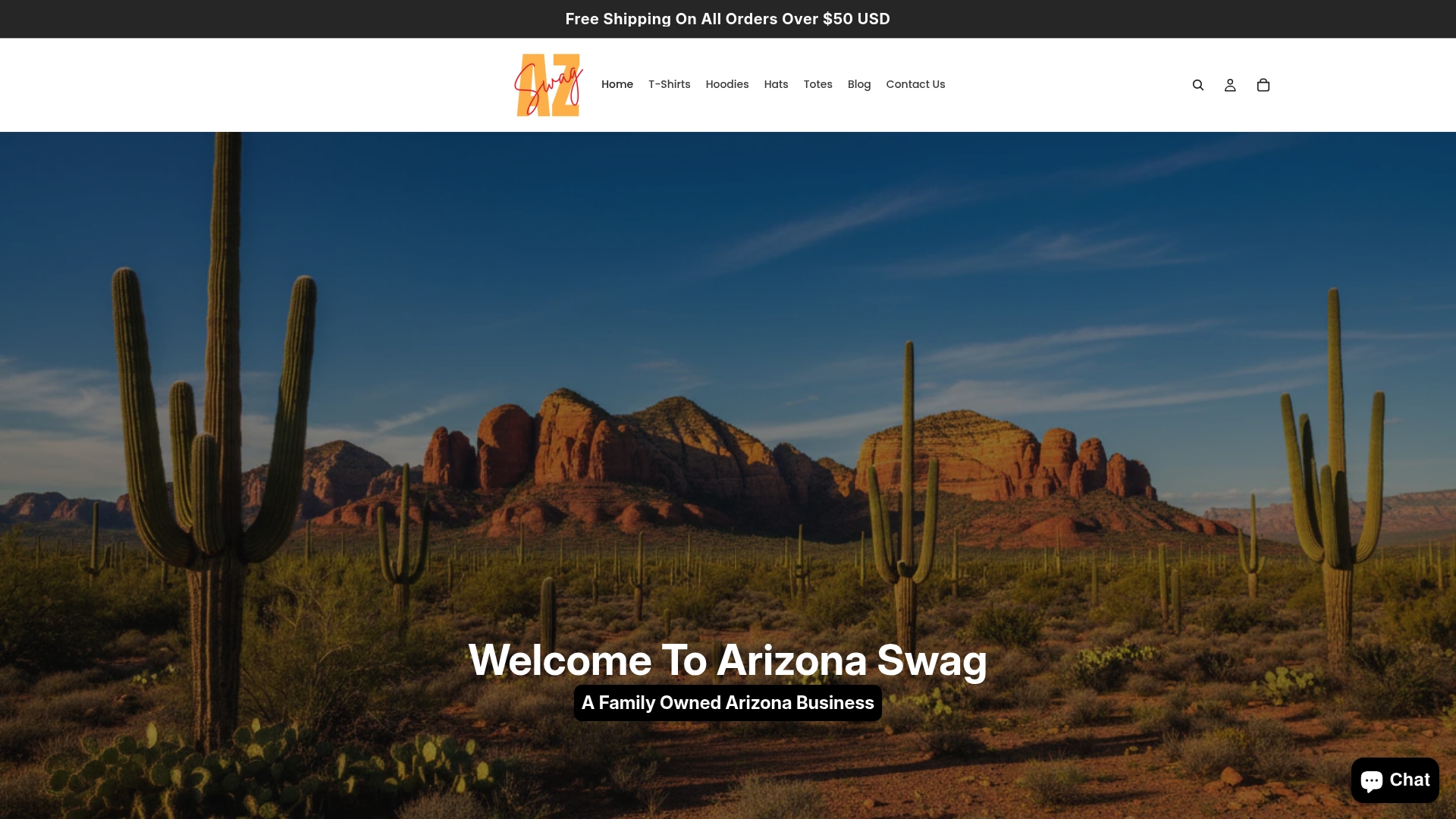
At Arizona Swag, we design apparel that captures the real color story of Arizona’s landscapes. From terracotta-toned tees to sage-accented hoodies and desert-themed graphic designs on totes and hats, every piece is built around the palette principles you’ve just learned. We’re a family-owned business, and we put genuine care into making sure each design feels like wearable art that reflects the place we love. Browse the collection and find the colors that speak to your personal desert aesthetic.
Frequently asked questions
What are the main colors in a genuine Arizona palette?
Arizona palettes center on warm earth tones including rust, camel, and tan, along with sage and olive greens, dusty blue, ivory, and cream. As Arizona travel fashion guidance confirms, white and cream serve as essential high-contrast tools when worn against the red rock backdrop.
Which colors should I avoid for Arizona outfits?
Avoid bright neon, hot pink, and true black. As Arizona outfit guidance notes, bright neon and hot pink clash with or wash out against the landscape, while true black absorbs heat aggressively in the desert sun.
Are Arizona color palettes just for clothing?
No, these palettes also inspire interior design, art, and branding throughout the Southwest. The same earth tones, sage greens, and dusty blues that work in apparel translate naturally into home décor, graphic design, and regional artwork.
Can I mix Arizona palette colors with everyday clothing basics?
Yes, most Arizona tones pair effortlessly with wardrobe staples like denim, white tees, and tan accessories. Camel and rust work especially well with light-wash denim, and dusty blue reads naturally alongside almost any warm earth tone you already own.


